Herlimedical
Belgian medical equipment supplier
Tech stack: Magento 1
Services: Website refinement, Redesign, Maintenance, Support
Location: Belgium
Industry: E-commerce, Pharmaceuticals, Dental equipment and supplies, Wholesale
Team composition: 1 project manager, 3 developers, 1 QA, 2 designers
Timelines: 2018—2020, ~800 hours
Overview
Herli Medical is a renowned supplier of medical products and accessories for the care and health sector in B2B and B2C.
Although the company focuses on gynecological equipment, they supply specialized equipment for almost all areas of healthcare. Herli Medical has gained the trust of many healthcare institutions in Belgium, France, and many other EU countries due to its increased focus on service.
Prerequisites
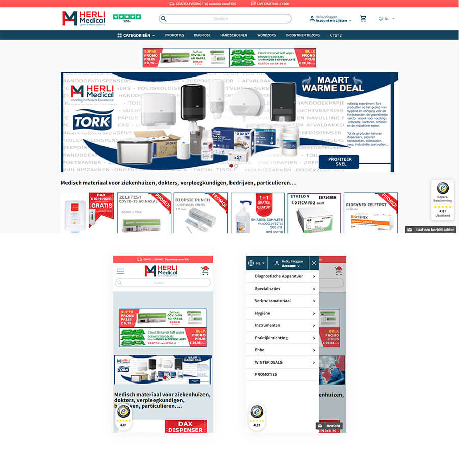
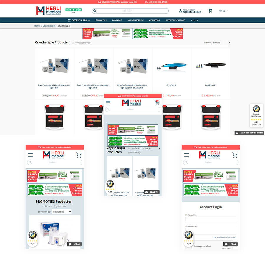
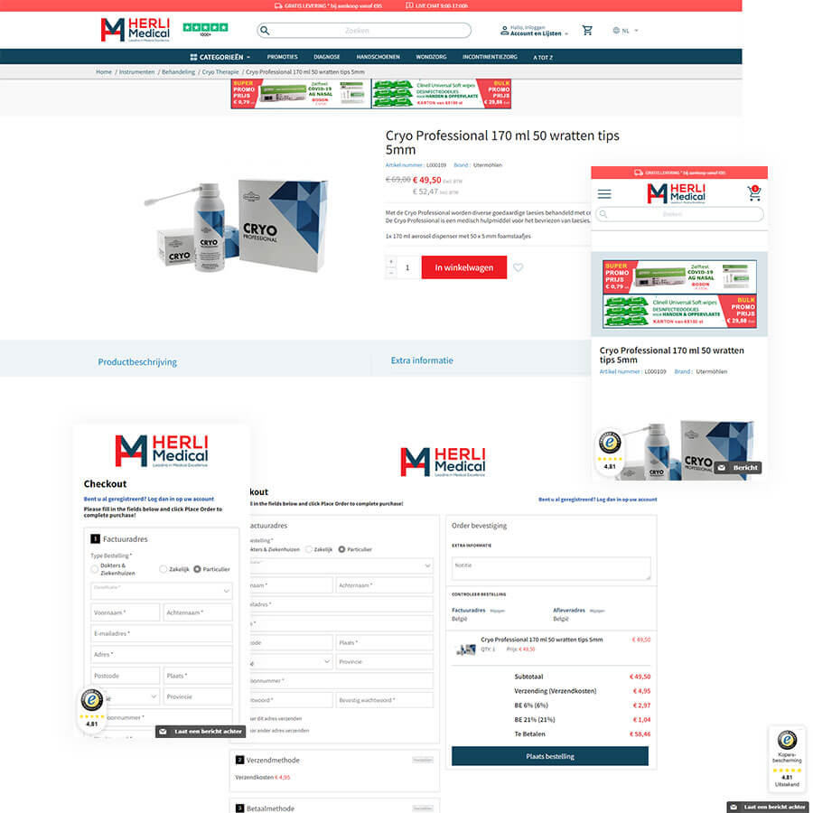
Herli Medical came to us with a request to improve their website, design, and, most importantly, the mobile version of the store. At the time, the site was quite outdated and required significant updates to meet modern standards.


Challenge
We had to bring the site in order without having to rewrite it completely. In cases like this, when you have to work with a lot of old legacy code, it’s always a very time-consuming process that can be compared to Augean stables.
The second challenge was the mobile version of the site. According to web development standards, the mobile-first approach should have been used. It says that the mobile version is designed first, and then the design for the desktop version is based on it. We had an opposite situation: we had a desktop version with a lot of old legacy code, which had to be fixed, again, without much rewriting so that the mobile version could work properly.
Solution
In the course of the project we redesigned the website twice at the request of the client, so the stages are as follows:
- Fixing the site
- Redesign
- Making improvements
- Maintenance
- Redesign
- Maintenance
- Support
Results
We significantly improved the performance of the mobile version of the site and the UX/UI design of the store as a whole. A year after the start of the project, the client came to us again with a request to update the design to align with current trends. The redesigned store runs better, is much easier to navigate, and is more intuitive for users. During the two years of the project, we have made numerous updates and provided ongoing support, so the client was completely satisfied with our service.
